> ## Documentation Index
> Fetch the complete documentation index at: https://docs.getnativeflow.com/llms.txt
> Use this file to discover all available pages before exploring further.
# Component States and Variants
> Pick a component's built in look, and pin it into a state while you design against it.
## Overview
Most of a component's look is chosen, not hand built. A Button is not red because someone typed `#DC2626` into it. It is red because its **Action** is set to `Negative`.
Studio puts those choices in two blocks at the top of a selected component's **Style** tab:
* **APPEARANCE**: `Variant`, `Action` and `Size`, the built in looks a component ships with.
* **STATE**: on/off flags such as Disabled and Loading, which pin the component into that state so you can see and build against it.
Both blocks live in the **Style** tab of the **Properties** panel, with a component selected on the canvas. APPEARANCE is at the top, STATE sits directly below it.
The recording above is a real, unscripted session — it runs at automation speed with no narration. Applying the preset overwrites the button's own label, exactly as [Themed Components](/features/themed-components) warns; the recording ends with it retyped back.
## Appearance: Variant, Action and Size
Select a Button and you get all three.
| Property | Control | Options |
| - | - | - |
| **Variant** | Segmented buttons | `Solid`, `Outline`, `Link` |
| **Action** | Dropdown, each option with a colour dot | `Primary`, `Secondary`, `Positive`, `Negative`, `Default` |
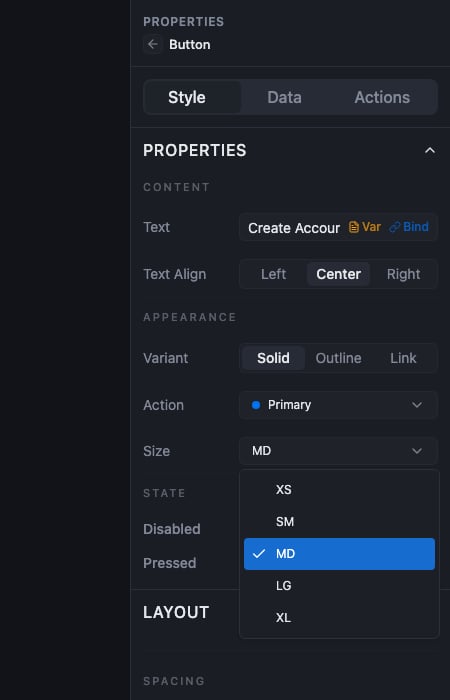
| **Size** | Dropdown | `XS`, `SM`, `MD`, `LG`, `XL` |
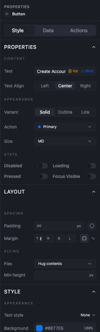 **Action is the semantic one.** You tell the component what it means, and Studio picks the colour from that. Each option carries its own colour dot: Primary blue, Positive green, Negative red, Secondary and Default grey.
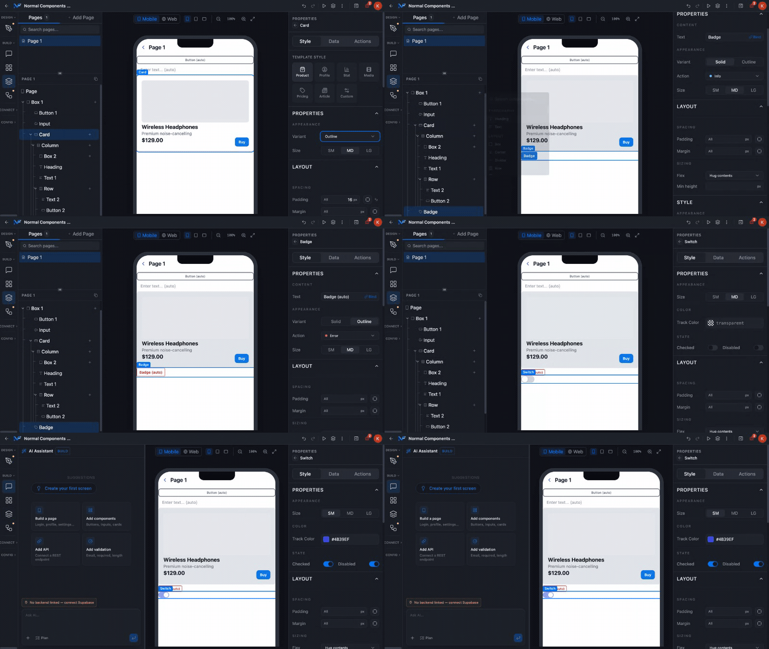
 Not every component has all three, and the same property can use a different control on a different type.
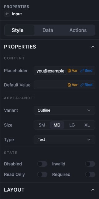
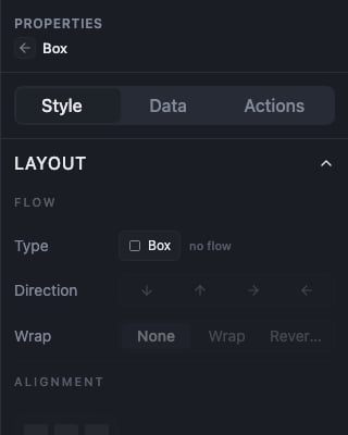
An **Input** renders Variant as a *dropdown* rather than segmented buttons, renders Size as *segmented buttons* `SM / MD / LG / XL` rather than a dropdown, and adds a **Type** property a Button does not have. A layout component such as **Box** has no PROPERTIES section at all. Its panel starts at LAYOUT.
These are the built in looks each component ships with. To save a look of your own under a name and reuse it, create a themed preset.
## The STATE section
STATE toggles do not describe a styling rule. They pin the component into that state on the canvas so you can design against it.
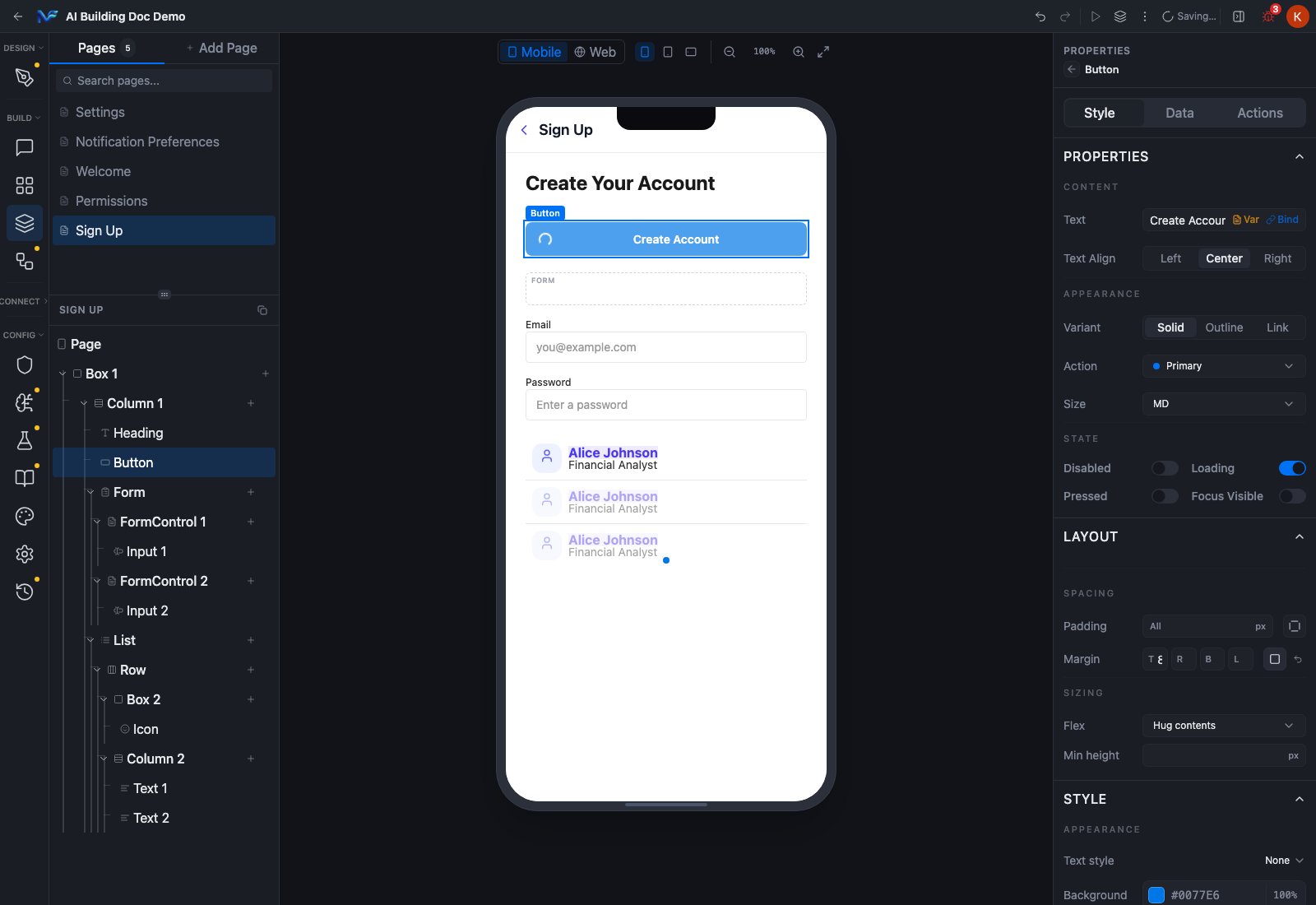
A Button has four: **Disabled**, **Loading**, **Pressed**, **Focus Visible**. Two of them change what you see, and two do not.
| Toggle | Effect on the Studio canvas |
| - | - |
| **Disabled** | Dims the component |
| **Loading** | Shows a spinner in place of the label |
| **Pressed** | No observable change |
| **Focus Visible** | No observable change |
Not every component has all three, and the same property can use a different control on a different type.
An **Input** renders Variant as a *dropdown* rather than segmented buttons, renders Size as *segmented buttons* `SM / MD / LG / XL` rather than a dropdown, and adds a **Type** property a Button does not have. A layout component such as **Box** has no PROPERTIES section at all. Its panel starts at LAYOUT.
These are the built in looks each component ships with. To save a look of your own under a name and reuse it, create a themed preset.
## The STATE section
STATE toggles do not describe a styling rule. They pin the component into that state on the canvas so you can design against it.
A Button has four: **Disabled**, **Loading**, **Pressed**, **Focus Visible**. Two of them change what you see, and two do not.
| Toggle | Effect on the Studio canvas |
| - | - |
| **Disabled** | Dims the component |
| **Loading** | Shows a spinner in place of the label |
| **Pressed** | No observable change |
| **Focus Visible** | No observable change |
 ### STATE means boolean flags, not only interaction states
Different component types put quite different things in this section.
| Component | Its STATE toggles |
| - | - |
| **Button** | Disabled, Loading, Pressed, Focus Visible |
| **Input** | Disabled, Invalid, Read Only, Required |
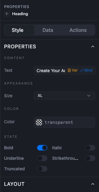
| **Heading** | Bold, Italic, Underline, Strikethrough, Truncated |
| **Box** | No PROPERTIES section at all |
### STATE means boolean flags, not only interaction states
Different component types put quite different things in this section.
| Component | Its STATE toggles |
| - | - |
| **Button** | Disabled, Loading, Pressed, Focus Visible |
| **Input** | Disabled, Invalid, Read Only, Required |
| **Heading** | Bold, Italic, Underline, Strikethrough, Truncated |
| **Box** | No PROPERTIES section at all |
 Read the section as "this component's boolean flags" rather than "its interaction states".
## Where per state styling lives
A selected component's Style tab has, in order: PROPERTIES, LAYOUT, STYLE, CONDITIONAL, PLATFORM VISIBILITY, CONDITIONAL VISIBILITY, RESPONSIVE VISIBILITY, THEMED COMPONENT.
Two of those carry a second look for a component:
1. **Conditional styling**, the `CONDITIONAL` toggle, which gives you a second look for when a condition holds, such as a selected list row.
2. **A themed preset**, which is where hover overrides are defined. They live in the themed component editor and apply on the Web target.
Save a component's styling once, reuse it anywhere, and get the only hover override Studio offers.
## Reusing a look across a project
If you want one component you configure once and reuse everywhere, that is a themed preset. If you want a group of components you can drop in as a unit, some types such as Card, List, CardList and Table expose a **Template Style** property that builds out a whole nested structure for you.
## Summary
APPEARANCE picks a component's built in look, and `Action` is the property that carries meaning and drives colour. STATE pins a component into a flag state while you design, with Disabled and Loading being the two that visibly change the canvas on a Button. Reach for a themed preset when you need one look reused across a project.
Read the section as "this component's boolean flags" rather than "its interaction states".
## Where per state styling lives
A selected component's Style tab has, in order: PROPERTIES, LAYOUT, STYLE, CONDITIONAL, PLATFORM VISIBILITY, CONDITIONAL VISIBILITY, RESPONSIVE VISIBILITY, THEMED COMPONENT.
Two of those carry a second look for a component:
1. **Conditional styling**, the `CONDITIONAL` toggle, which gives you a second look for when a condition holds, such as a selected list row.
2. **A themed preset**, which is where hover overrides are defined. They live in the themed component editor and apply on the Web target.
Save a component's styling once, reuse it anywhere, and get the only hover override Studio offers.
## Reusing a look across a project
If you want one component you configure once and reuse everywhere, that is a themed preset. If you want a group of components you can drop in as a unit, some types such as Card, List, CardList and Table expose a **Template Style** property that builds out a whole nested structure for you.
## Summary
APPEARANCE picks a component's built in look, and `Action` is the property that carries meaning and drives colour. STATE pins a component into a flag state while you design, with Disabled and Loading being the two that visibly change the canvas on a Button. Reach for a themed preset when you need one look reused across a project.