> ## Documentation Index
> Fetch the complete documentation index at: https://docs.getnativeflow.com/llms.txt
> Use this file to discover all available pages before exploring further.
# Theming
> Define a project's colours, text styles and app shell once, so every screen picks them up.
## Overview
Theme Settings is the project wide design system. Colours, text styles and app shell behaviour are defined in one place, and every screen in the project reads from there instead of each component carrying its own hard coded values.
Without it, a purple button is purple because someone typed `#4B39EF` into that one button. With it, the button is `$Primary`, and changing `$Primary` once changes every component bound to it, on the canvas and in the exported app. The same idea applies to text, where you pick a "Body Medium" style rather than "14px Roboto normal", and to the app shell, where you configure one header rather than one per screen.
In the left sidebar, expand **CONFIG** and click the palette icon, whose tooltip reads **Theme Settings**. The pane that opens is headed **Runtime Theme**, subtitled "Drives the canvas and the exported app. Separate from the agent-authored Foundation → Design System spec." The sidebar entry and the pane header are two names for the same place, and neither is the separate Foundation → Design System document, which is an AI written plan rather than an editor.
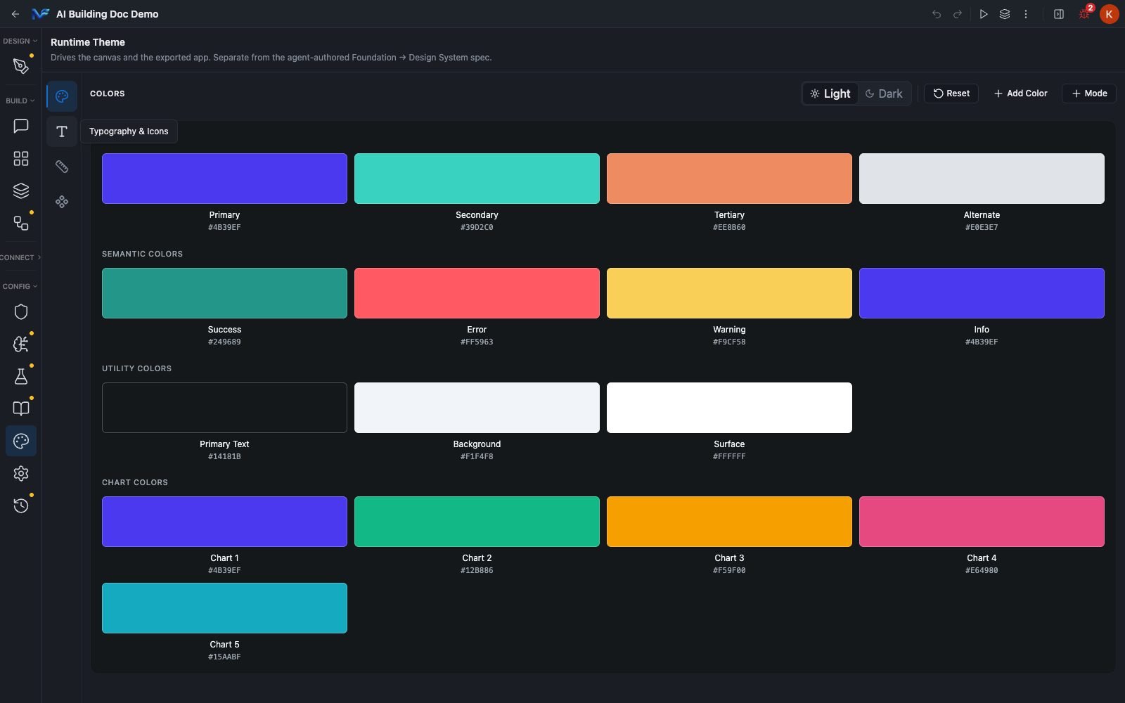
The pane has a four icon rail down its left side: **Colors**, **Typography & Icons**, **App Config** and **Themed Components**.
 The fourth rail icon is where these tokens get consumed. It has its own page.
The recording above is a real, unscripted session — it runs at automation speed with no narration. The Primary token is taken from `#4B39EF` to `#E8590C` and back to `#4B39EF` in the same dialog session, and confirmed back at `#4B39EF` on a fresh reload afterward. No stepper or edit control is touched in Typography or App Config — those two sub-sections are only read on camera.
## Colours
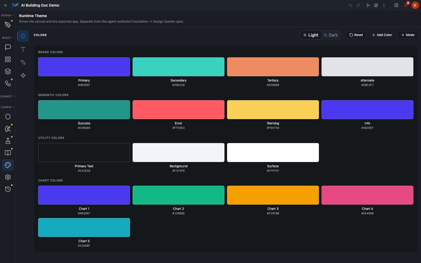
Colors opens by default. Tokens are grouped into four sets.
| Group | Tokens |
| - | - |
| **BRAND COLORS** | Primary, Secondary, Tertiary, Alternate |
| **SEMANTIC COLORS** | Success, Error, Warning, Info |
| **UTILITY COLORS** | Primary Text, Background, Surface |
| **CHART COLORS** | Chart 1 through Chart 5 |
That is 16 tokens on a project created from Studio's defaults.
The fourth rail icon is where these tokens get consumed. It has its own page.
The recording above is a real, unscripted session — it runs at automation speed with no narration. The Primary token is taken from `#4B39EF` to `#E8590C` and back to `#4B39EF` in the same dialog session, and confirmed back at `#4B39EF` on a fresh reload afterward. No stepper or edit control is touched in Typography or App Config — those two sub-sections are only read on camera.
## Colours
Colors opens by default. Tokens are grouped into four sets.
| Group | Tokens |
| - | - |
| **BRAND COLORS** | Primary, Secondary, Tertiary, Alternate |
| **SEMANTIC COLORS** | Success, Error, Warning, Info |
| **UTILITY COLORS** | Primary Text, Background, Surface |
| **CHART COLORS** | Chart 1 through Chart 5 |
That is 16 tokens on a project created from Studio's defaults.
 ### Editing a token
Each swatch is one clickable card. The colour block, the name and the hex are all a single button. Clicking it opens the **Choose a Color** dialog, which gives you a saturation and brightness square, a hue slider, an alpha slider, a hex field you can type into, R/G/B/A number fields, and a Recent Colors row once you have picked colours in the session.
### Editing a token
Each swatch is one clickable card. The colour block, the name and the hex are all a single button. Clicking it opens the **Choose a Color** dialog, which gives you a saturation and brightness square, a hue slider, an alpha slider, a hex field you can type into, R/G/B/A number fields, and a Recent Colors row once you have picked colours in the session.
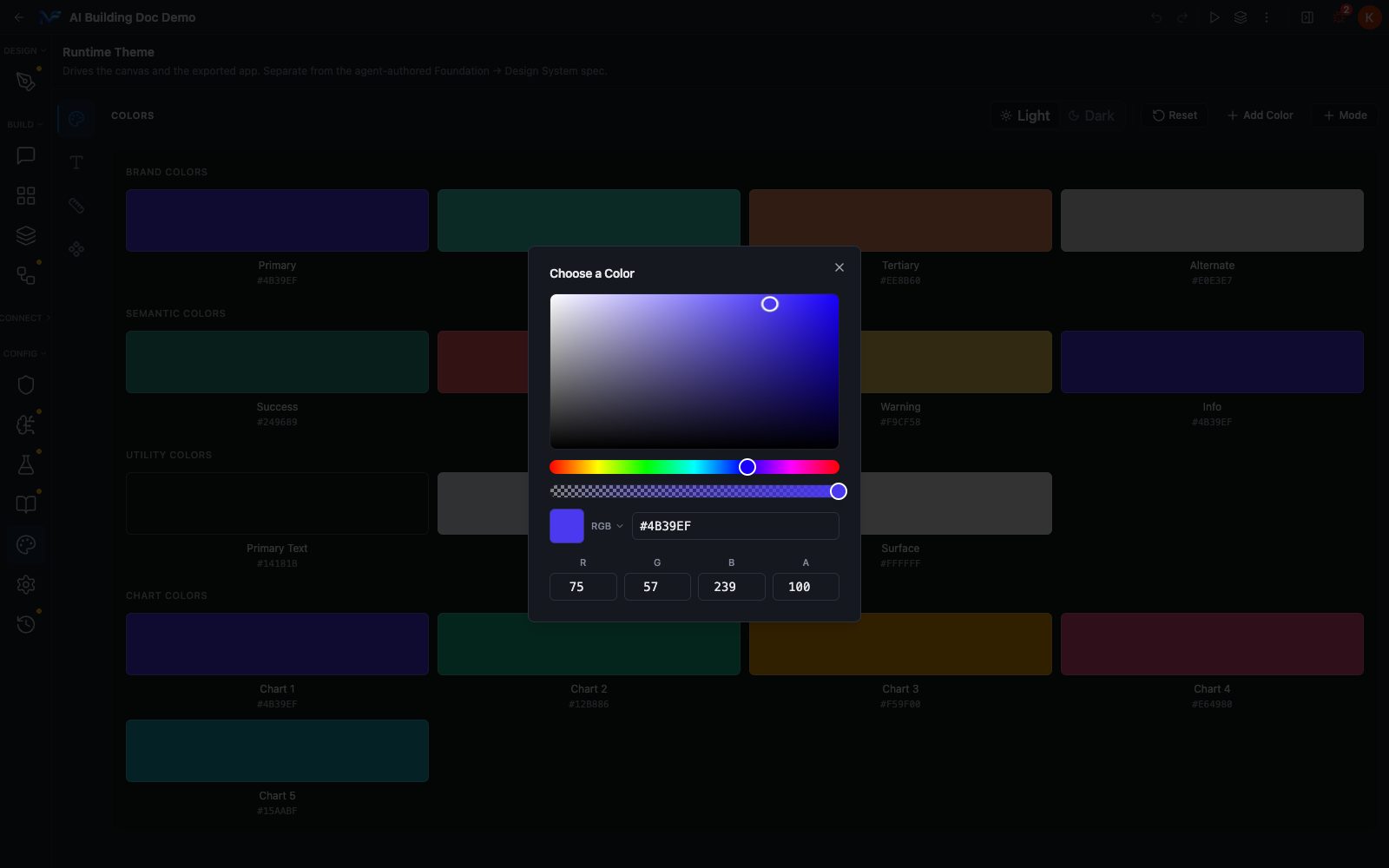 There is no Save or Apply button in the dialog. The change applies as you make it, and the header's autosave indicator moves from "Saving..." to "Saved".
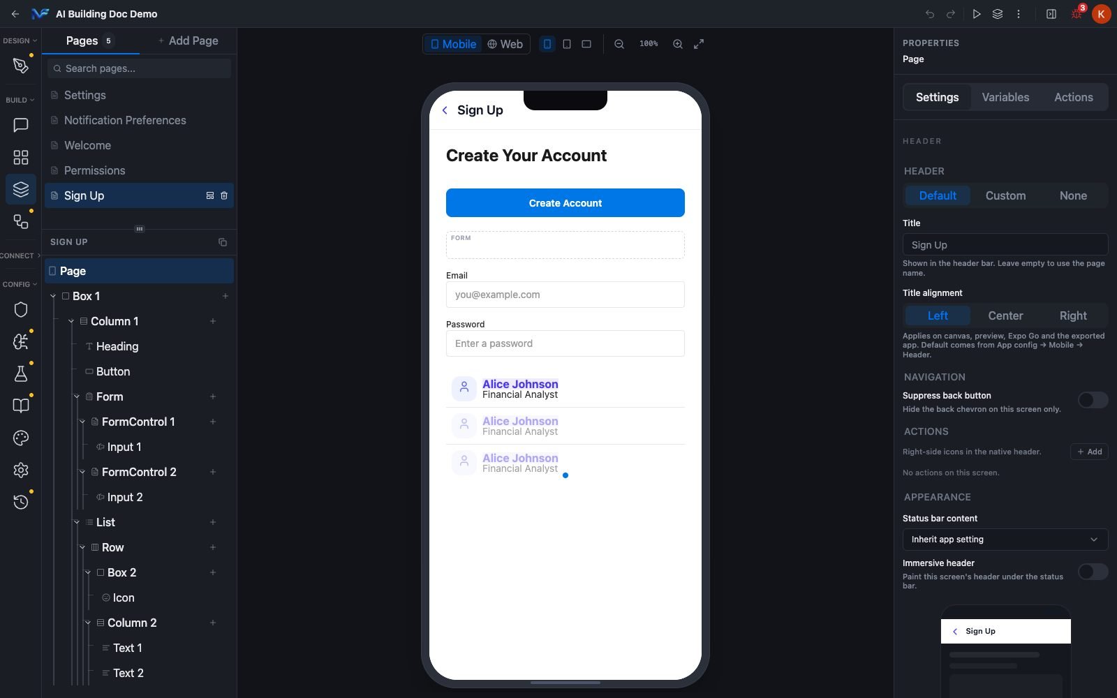
**The edit reaches the canvas live.** Setting Primary to `#E8590C` and going straight back to a page showed the change already applied, with no reload. On a page whose list rows are bound to `$Primary`, all three rows turned orange.
There is no Save or Apply button in the dialog. The change applies as you make it, and the header's autosave indicator moves from "Saving..." to "Saved".
**The edit reaches the canvas live.** Setting Primary to `#E8590C` and going straight back to a page showed the change already applied, with no reload. On a page whose list rows are bound to `$Primary`, all three rows turned orange.
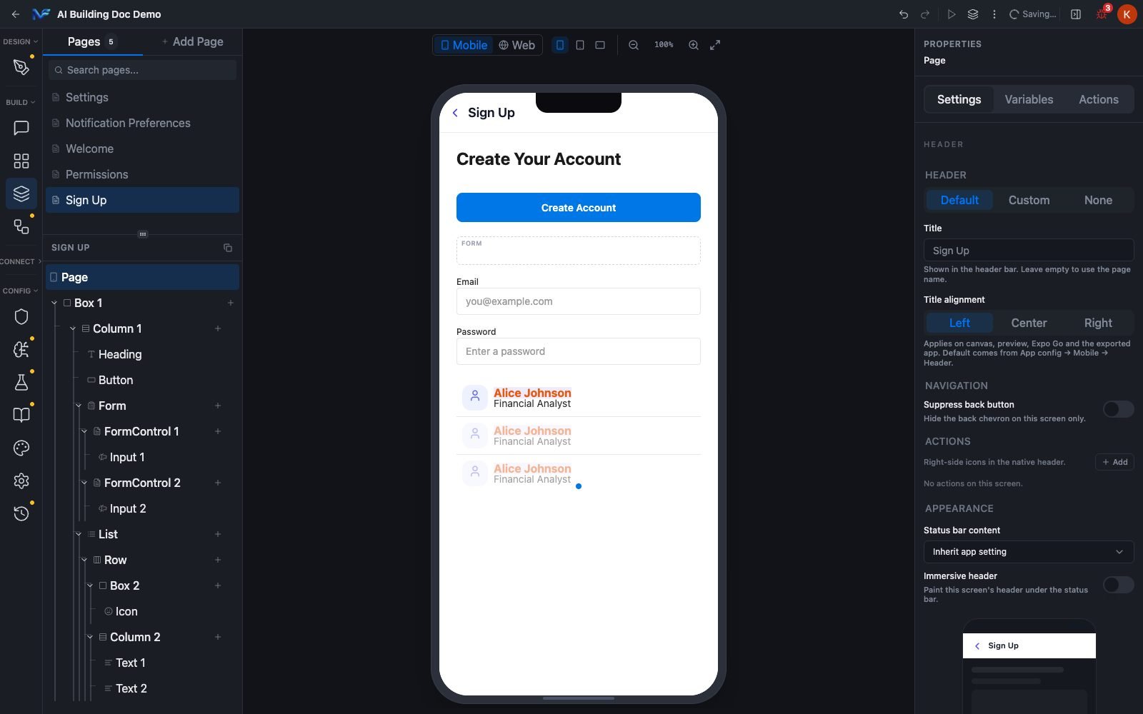 Only components bound to a token follow a token edit. A component holding a literal hex will not change.
In the verified example, the blue "Create Account" button on the same page did not move when Primary changed, because it carries a literal colour rather than `$Primary`. If a token edit appears to do nothing, check the component's colour property first.
### Light and Dark
Every token holds a separate value per mode, so the same 16 names carry a different set of values under Dark.
| Token | Light | Dark |
| - | - | - |
| Primary | `#4B39EF` | `#8B7FFF` |
| Background | `#F1F4F8` | `#14181B` |
| Surface | `#FFFFFF` | `#1E2429` |
| Primary Text | `#14181B` | `#F1F4F8` |
**The Light/Dark toggle scopes editing, not preview.** Selecting Dark shows you the Dark values so you can edit them. It does not switch the canvas.
This was checked directly. With Dark selected, switching back to a page showed the canvas rendering the Light values still: same white background, same purple text. Nothing is broken when that happens.
Only components bound to a token follow a token edit. A component holding a literal hex will not change.
In the verified example, the blue "Create Account" button on the same page did not move when Primary changed, because it carries a literal colour rather than `$Primary`. If a token edit appears to do nothing, check the component's colour property first.
### Light and Dark
Every token holds a separate value per mode, so the same 16 names carry a different set of values under Dark.
| Token | Light | Dark |
| - | - | - |
| Primary | `#4B39EF` | `#8B7FFF` |
| Background | `#F1F4F8` | `#14181B` |
| Surface | `#FFFFFF` | `#1E2429` |
| Primary Text | `#14181B` | `#F1F4F8` |
**The Light/Dark toggle scopes editing, not preview.** Selecting Dark shows you the Dark values so you can edit them. It does not switch the canvas.
This was checked directly. With Dark selected, switching back to a page showed the canvas rendering the Light values still: same white background, same purple text. Nothing is broken when that happens.
 ### The three header buttons
* **Reset**. Restores the default colours.
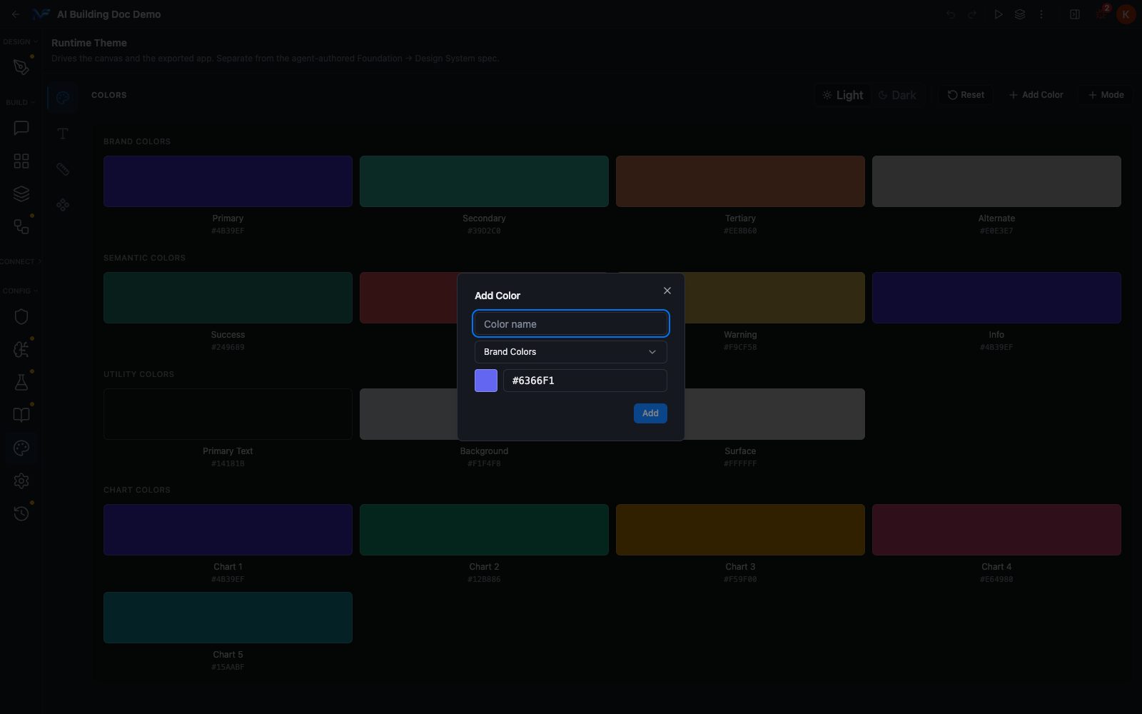
* **+ Add Color**. Opens a dialog with a **Color name** field, a group dropdown offering exactly the four groups above, and a swatch plus hex field.
* **+ Mode**. Opens **Add New Mode**, a single name field placeholdered "e.g. high-contrast" plus a **Create Mode** button. So a project is not limited to Light and Dark.
### The three header buttons
* **Reset**. Restores the default colours.
* **+ Add Color**. Opens a dialog with a **Color name** field, a group dropdown offering exactly the four groups above, and a swatch plus hex field.
* **+ Mode**. Opens **Add New Mode**, a single name field placeholdered "e.g. high-contrast" plus a **Create Mode** button. So a project is not limited to Light and Dark.
 ## Typography
The second rail icon. The pane is headed **TYPOGRAPHY** and has its own Light/Dark toggle, Reset and **+ Add Style**.
Two global font pickers sit above the table, with Studio's own explanation: "Primary = body & content text. Secondary = headings & display text for visual hierarchy."
## Typography
The second rail icon. The pane is headed **TYPOGRAPHY** and has its own Light/Dark toggle, Reset and **+ Add Style**.
Two global font pickers sit above the table, with Studio's own explanation: "Primary = body & content text. Secondary = headings & display text for visual hierarchy."
 The recording above is a real, unscripted session — it runs at automation speed with no narration. Only the **Weight** dropdown is actually changed, on the **Body Large** row, and it's back to `Normal` before the recording ends — confirmed on a fresh reload afterward, not just an in-session check. The Color and Font Family dropdowns are opened to show their options and dismissed with Escape rather than a pick, and no numeric stepper is touched anywhere in the pass.
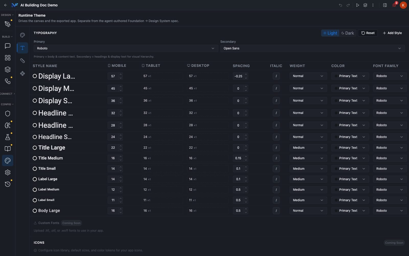
The table holds **18 named styles** in seven families: Display, Headline, Title, Label, Body, Overline and Caption. Each row's name is rendered in its own style, so the table doubles as a specimen sheet.
| Per row field | What it is |
| - | - |
| **Mobile** | An editable number stepper. This is the authored base size. |
| **Tablet** and **Desktop** | Derived values shown as a number plus a multiplier chip, for example `57 x1`. They follow the Mobile value automatically. |
| **Spacing** | Letter spacing, as a number stepper. |
| **Italic** | A single `I` toggle. |
| **Weight** | A dropdown: Light, Normal, Medium, Semi Bold, Bold, Extra Bold. |
| **Color** | A dropdown of the project's own 16 colour tokens, each with its live swatch. |
| **Font Family** | A dropdown of 13 built in fonts, from Roboto through Noto Sans JP. |
The recording above is a real, unscripted session — it runs at automation speed with no narration. Only the **Weight** dropdown is actually changed, on the **Body Large** row, and it's back to `Normal` before the recording ends — confirmed on a fresh reload afterward, not just an in-session check. The Color and Font Family dropdowns are opened to show their options and dismissed with Escape rather than a pick, and no numeric stepper is touched anywhere in the pass.
The table holds **18 named styles** in seven families: Display, Headline, Title, Label, Body, Overline and Caption. Each row's name is rendered in its own style, so the table doubles as a specimen sheet.
| Per row field | What it is |
| - | - |
| **Mobile** | An editable number stepper. This is the authored base size. |
| **Tablet** and **Desktop** | Derived values shown as a number plus a multiplier chip, for example `57 x1`. They follow the Mobile value automatically. |
| **Spacing** | Letter spacing, as a number stepper. |
| **Italic** | A single `I` toggle. |
| **Weight** | A dropdown: Light, Normal, Medium, Semi Bold, Bold, Extra Bold. |
| **Color** | A dropdown of the project's own 16 colour tokens, each with its live swatch. |
| **Font Family** | A dropdown of 13 built in fonts, from Roboto through Noto Sans JP. |
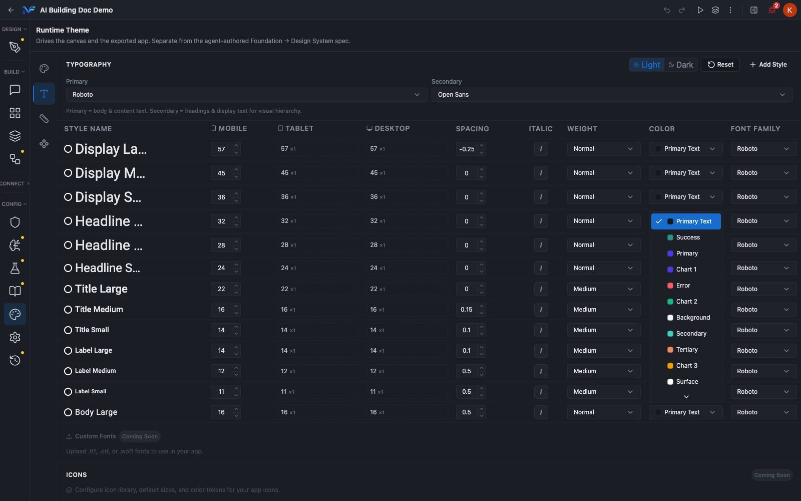 **Typography colours are token references, not literals.** That is the direct link back to Colors: edit a token there and it flows through the type scale too.
The Tablet and Desktop multiplier comes from **App Config → Shared → Themed Component Scale → Font scale**, which is `1` for both tiers by default. To move all three tiers, change the Mobile value. To change the tier relationship, change the Font scale. Clicking a tier cell switches it to an explicit pinned value instead of the derived one.
The tier cells are steppers, and clicking the middle of one can land on an arrow and silently change the size by one. During verification a Caption size went from `12` to `11` exactly that way. Check the value after you click a cell.
## App Config
The third rail icon holds the app shell: navigation chrome, header, feedback, breakpoints and scale.
**On a Mobile-target project, this is a two way Mobile / Common toggle, not three way.** Re-checked live: the toggle here reads only **Mobile** and **Common**, and Common is the union of what used to be described as separate Web and Shared tabs — Branding, Feedback & Motion and Layout & Responsive all live there, scoped "Applies to the whole app." A dedicated Web tab with navigation-chrome choices (Sidebar, Navbar, Drawer, and so on) was searched for and not found on this project. The most likely explanation is that tab only appears once a project's own target (App Details → Project Type) is set to Web rather than Mobile — plausible, but not confirmed, since switching a project's target is a bigger change than anything else made for this page. Read the **Web** subsection below as accurate for a Web-target project; it just is not what this project's own toggle shows.
The recording above is a real, unscripted session — it runs at automation speed with no narration. Only **Navigation** and **Immersive header** are actually changed, both confirmed back to their original states on a fresh reload afterward. Nothing in the Common tab is touched.
**App Config is not App Settings.** They are one icon apart in the CONFIG group and they hold different things. App Config is the app shell. App Settings is the app's identity and packaging: names, package name, entry page, icon and splash, deep link scheme, languages.
If you came looking for navigation type or breakpoints, you are in the right place. If you came looking for the app icon or the supported locales, see the App Settings page.
App details, assets, deep linking and languages, in the pane one icon below this one.
### Mobile
**Typography colours are token references, not literals.** That is the direct link back to Colors: edit a token there and it flows through the type scale too.
The Tablet and Desktop multiplier comes from **App Config → Shared → Themed Component Scale → Font scale**, which is `1` for both tiers by default. To move all three tiers, change the Mobile value. To change the tier relationship, change the Font scale. Clicking a tier cell switches it to an explicit pinned value instead of the derived one.
The tier cells are steppers, and clicking the middle of one can land on an arrow and silently change the size by one. During verification a Caption size went from `12` to `11` exactly that way. Check the value after you click a cell.
## App Config
The third rail icon holds the app shell: navigation chrome, header, feedback, breakpoints and scale.
**On a Mobile-target project, this is a two way Mobile / Common toggle, not three way.** Re-checked live: the toggle here reads only **Mobile** and **Common**, and Common is the union of what used to be described as separate Web and Shared tabs — Branding, Feedback & Motion and Layout & Responsive all live there, scoped "Applies to the whole app." A dedicated Web tab with navigation-chrome choices (Sidebar, Navbar, Drawer, and so on) was searched for and not found on this project. The most likely explanation is that tab only appears once a project's own target (App Details → Project Type) is set to Web rather than Mobile — plausible, but not confirmed, since switching a project's target is a bigger change than anything else made for this page. Read the **Web** subsection below as accurate for a Web-target project; it just is not what this project's own toggle shows.
The recording above is a real, unscripted session — it runs at automation speed with no narration. Only **Navigation** and **Immersive header** are actually changed, both confirmed back to their original states on a fresh reload afterward. Nothing in the Common tab is touched.
**App Config is not App Settings.** They are one icon apart in the CONFIG group and they hold different things. App Config is the app shell. App Settings is the app's identity and packaging: names, package name, entry page, icon and splash, deep link scheme, languages.
If you came looking for navigation type or breakpoints, you are in the right place. If you came looking for the app icon or the supported locales, see the App Settings page.
App details, assets, deep linking and languages, in the pane one icon below this one.
### Mobile
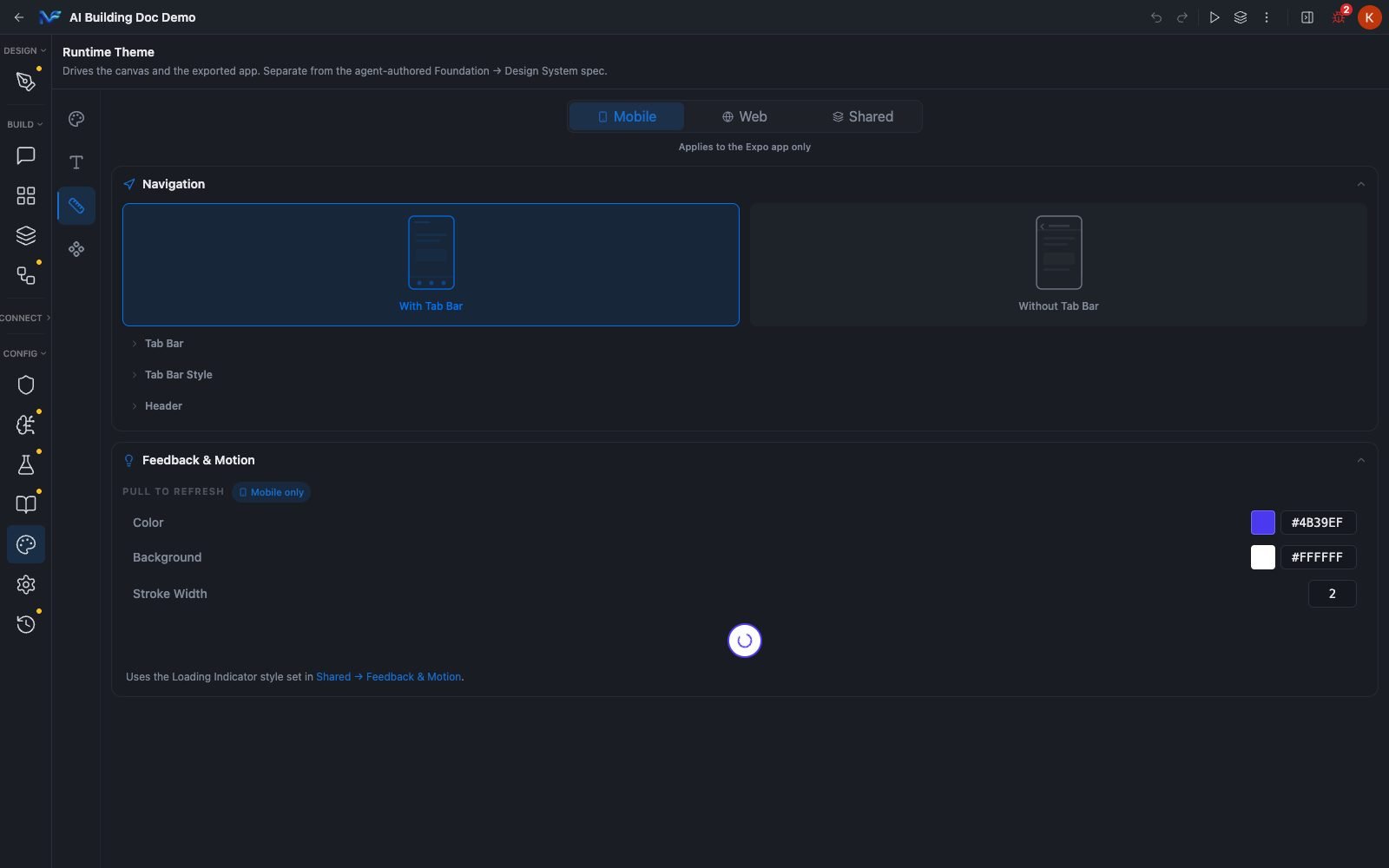 * **Navigation**: two illustrated, mutually exclusive choices, **With Tab Bar** and **Without Tab Bar**.
* **Tab Bar**: the list of tabs. An empty list shows a red "No tabs" marker and a **+ Add Tab** button.
* **Tab Bar Style**: Background, Active, Inactive, Icon Size, Label Size and a Show Labels toggle.
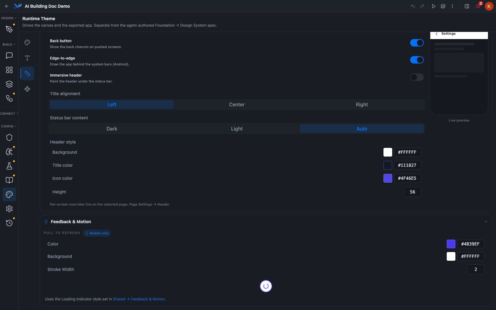
* **Header**: the native header for every screen. Default header, Back button, Edge-to-edge, Immersive header, Title alignment, Status bar content, and a Header style block with background, title colour, icon colour and height. A phone mock labelled **Live preview** updates as you change them. The section notes that per screen overrides live on the page itself, under Page Settings → Header.
* **Feedback & Motion**: a **PULL TO REFRESH** section badged Mobile only, with colour, background, stroke width and a live spinner preview. It uses the loading indicator style set on the Shared tab.
* **Navigation**: two illustrated, mutually exclusive choices, **With Tab Bar** and **Without Tab Bar**.
* **Tab Bar**: the list of tabs. An empty list shows a red "No tabs" marker and a **+ Add Tab** button.
* **Tab Bar Style**: Background, Active, Inactive, Icon Size, Label Size and a Show Labels toggle.
* **Header**: the native header for every screen. Default header, Back button, Edge-to-edge, Immersive header, Title alignment, Status bar content, and a Header style block with background, title colour, icon colour and height. A phone mock labelled **Live preview** updates as you change them. The section notes that per screen overrides live on the page itself, under Page Settings → Header.
* **Feedback & Motion**: a **PULL TO REFRESH** section badged Mobile only, with colour, background, stroke width and a live spinner preview. It uses the loading indicator style set on the Shared tab.
 ### Web
Marked since it's scoped to the Web target's own chrome — but see the correction note above: this subsection describes a Web tab that wasn't found on the Mobile-target project checked for this page, and is presumed to appear once a project's target is set to Web.
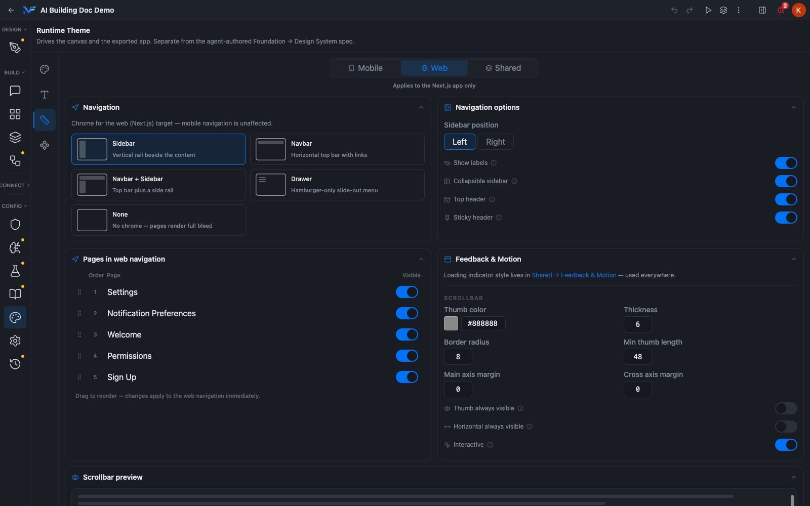
The Web tab is a genuinely different set of controls, not a mirror of Mobile.
* **Navigation**: five choices for the web chrome, **Sidebar**, **Navbar**, **Navbar + Sidebar**, **Drawer** and **None**.
* **Navigation options**: sidebar position, plus toggles for show labels, collapsible sidebar, top header and sticky header.
* **Pages in web navigation**: a drag to reorder list of the project's real pages, each with an order number and a **Visible** toggle. Reordering applies to the web navigation immediately.
* **Feedback & Motion**: a **SCROLLBAR** block with thumb colour, thickness, radius, minimum thumb length, margins and three toggles, plus a live preview.
### Web
Marked since it's scoped to the Web target's own chrome — but see the correction note above: this subsection describes a Web tab that wasn't found on the Mobile-target project checked for this page, and is presumed to appear once a project's target is set to Web.
The Web tab is a genuinely different set of controls, not a mirror of Mobile.
* **Navigation**: five choices for the web chrome, **Sidebar**, **Navbar**, **Navbar + Sidebar**, **Drawer** and **None**.
* **Navigation options**: sidebar position, plus toggles for show labels, collapsible sidebar, top header and sticky header.
* **Pages in web navigation**: a drag to reorder list of the project's real pages, each with an order number and a **Visible** toggle. Reordering applies to the web navigation immediately.
* **Feedback & Motion**: a **SCROLLBAR** block with thumb colour, thickness, radius, minimum thumb length, margins and three toggles, plus a live preview.
 ### Shared
* **Branding**: a single **Brand name** field.
* **Feedback & Motion → LOADING INDICATOR**: Type, Color as a token dropdown, and Size, with a live animated preview. This applies on both Mobile and Web.
* **Layout & Responsive**: background, foreground and active colours, then the project's breakpoints as a four stop slider at **0**, **479**, **767** and **991**, with Desktop having no upper bound.
* **THEMED COMPONENT SCALE**: two slider groups, each with a locked Mobile base of `1` and adjustable Tablet and Desktop multipliers. **Font scale** drives typography styles. **Theme scale** drives themed components, covering type, spacing, radii and icons. Colours and behaviour never scale.
### Shared
* **Branding**: a single **Brand name** field.
* **Feedback & Motion → LOADING INDICATOR**: Type, Color as a token dropdown, and Size, with a live animated preview. This applies on both Mobile and Web.
* **Layout & Responsive**: background, foreground and active colours, then the project's breakpoints as a four stop slider at **0**, **479**, **767** and **991**, with Desktop having no upper bound.
* **THEMED COMPONENT SCALE**: two slider groups, each with a locked Mobile base of `1` and adjustable Tablet and Desktop multipliers. **Font scale** drives typography styles. **Theme scale** drives themed components, covering type, spacing, radii and icons. Colours and behaviour never scale.
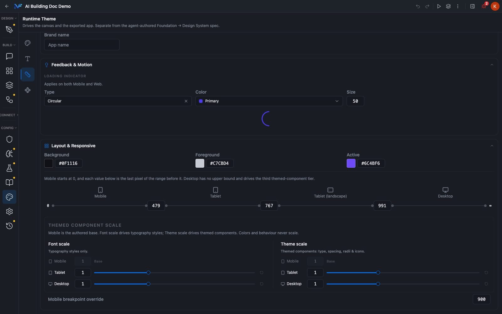 These breakpoint numbers are not the same vocabulary as the per component Responsive Visibility bands, which are Phone under 600px, Tablet 600 to 900px and Large Tablet above 900px. The Preview panel's three measured device sizes, 390, 768 and 1024, land one per Responsive Visibility band, but against these App Config bands they fall in Mobile, Tablet (landscape) and Desktop. The numbers are consistent. The labels are two different systems.
## Summary
Define colours as tokens, define text as named styles that reference those tokens, and define the app shell once per target under App Config. A token edit reaches the canvas live with no save step, but only components bound to the token follow it. The Light/Dark toggle picks which values you are editing, never what the canvas renders.
These breakpoint numbers are not the same vocabulary as the per component Responsive Visibility bands, which are Phone under 600px, Tablet 600 to 900px and Large Tablet above 900px. The Preview panel's three measured device sizes, 390, 768 and 1024, land one per Responsive Visibility band, but against these App Config bands they fall in Mobile, Tablet (landscape) and Desktop. The numbers are consistent. The labels are two different systems.
## Summary
Define colours as tokens, define text as named styles that reference those tokens, and define the app shell once per target under App Config. A token edit reaches the canvas live with no save step, but only components bound to the token follow it. The Light/Dark toggle picks which values you are editing, never what the canvas renders.