> ## Documentation Index
> Fetch the complete documentation index at: https://docs.getnativeflow.com/llms.txt
> Use this file to discover all available pages before exploring further.
# Page Configuration
> Configure a page's header, its variables and the actions that run on load, focus, blur or a header tap.
## Overview
Every page has configuration that lives separately from the components on its canvas. Select the page itself and the Properties panel swaps its component tabs for three page level tabs:
* **Settings**: the header, navigation and status bar for this screen.
* **Variables**: the parameters the page receives, the state local to it, and the state shared across the app.
* **Actions**: the events that run automatically as the page loads, gains focus, loses focus, or when someone taps a header icon.
By the end of this guide you will have set a page's header, created a page variable, and attached an action to a lifecycle event.
**Prerequisites**
* A NativeFlow Studio account, signed in, with a project open that has at least one page.
* No backend or auth provider is needed for any of the three tabs.
To select the page, click the **Page** row at the top of the Component Tree, or click empty canvas space with nothing else selected. If you still see Style, Data and Actions, a component is selected rather than the page.
The recording above is a real, unscripted session — it runs at automation speed with no narration. Every temporary object it creates (the header icon, the Page Variable, the action) is removed again by the end.
## Settings tab
The **HEADER** group has three fields:
* **Header**: a three way choice of **Default**, **Custom** or **None**.
* **Title**: a text field. Its placeholder is the page's own name. The helper text reads "Shown in the header bar. Leave empty to use the page name."
* **Title alignment**: **Left**, **Center** or **Right**. Helper text: "Applies on canvas, preview, Expo Go and the exported app. Default comes from App config > Mobile > Header."
A small live preview of the header bar renders at the bottom of the tab and updates as you change these fields.
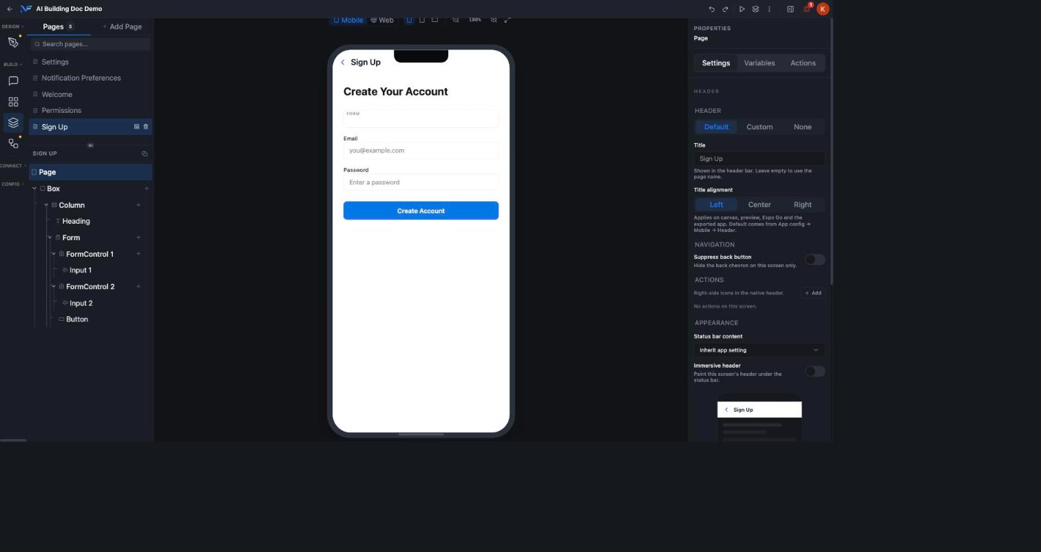 Under **NAVIGATION**, the **Suppress back button** toggle hides the back chevron on this screen only.
Under **APPEARANCE**:
* **Status bar content**: a dropdown that defaults to "Inherit app setting."
* **Immersive header**: a toggle that paints this screen's header under the status bar.
The **ACTIONS** group in this tab is labelled "Right-side icons in the native header" and starts empty with "No actions on this screen."
Click **+ Add** and you get one header icon row: an icon picker, a **Label (accessibility)** text field, and a behaviour dropdown with four options: **No behaviour**, **Navigate to page**, **Go back** and **Open drawer**. The icon appears in the canvas header straight away. A trash icon on the row removes it.
Under **NAVIGATION**, the **Suppress back button** toggle hides the back chevron on this screen only.
Under **APPEARANCE**:
* **Status bar content**: a dropdown that defaults to "Inherit app setting."
* **Immersive header**: a toggle that paints this screen's header under the status bar.
The **ACTIONS** group in this tab is labelled "Right-side icons in the native header" and starts empty with "No actions on this screen."
Click **+ Add** and you get one header icon row: an icon picker, a **Label (accessibility)** text field, and a behaviour dropdown with four options: **No behaviour**, **Navigate to page**, **Go back** and **Open drawer**. The icon appears in the canvas header straight away. A trash icon on the row removes it.
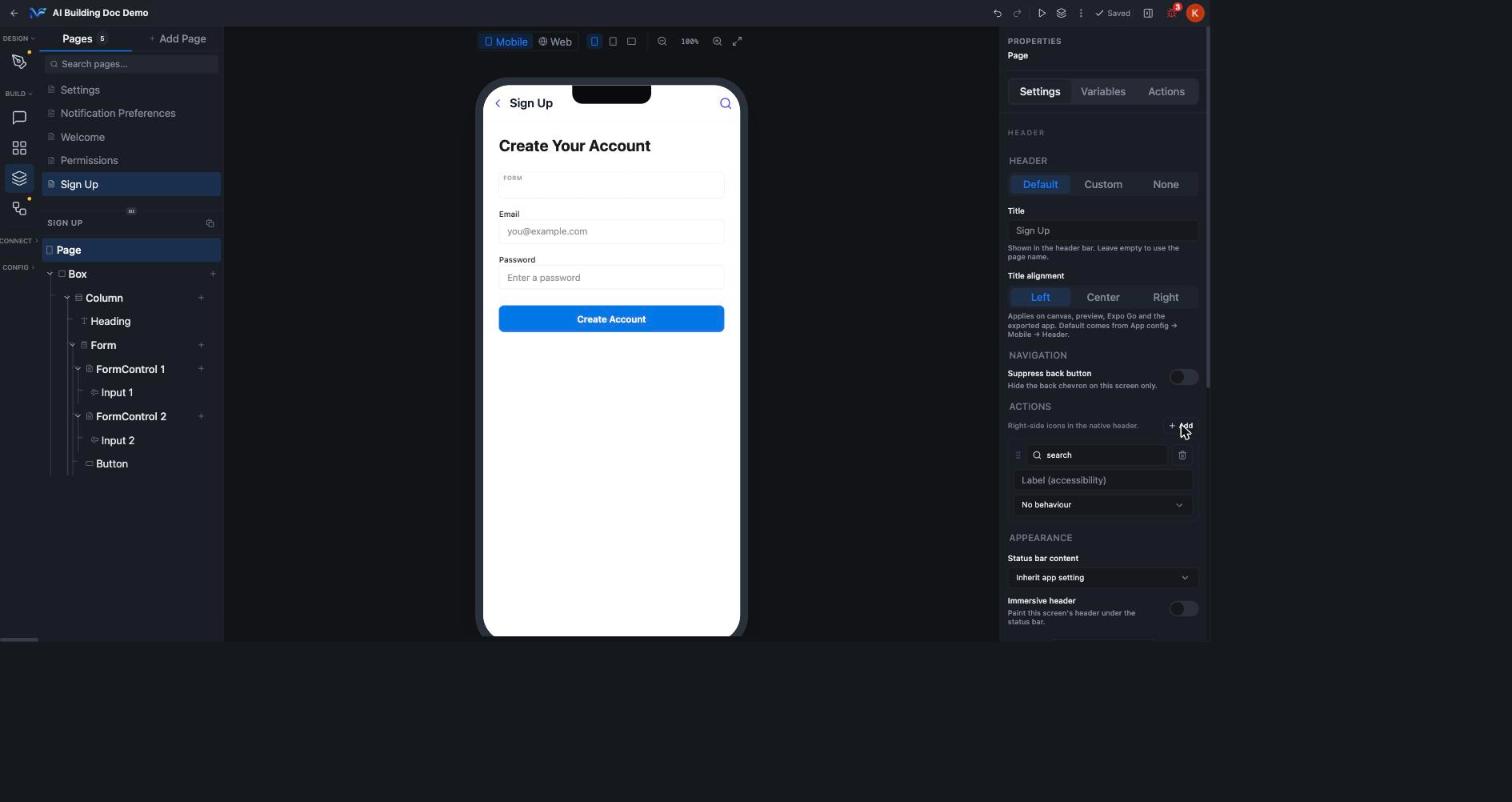 "Actions" means two different things in this tab set. The **Settings** tab's ACTIONS section configures which icons appear in the header, with a simple built in behaviour. The separate **Actions** tab's **On Header Action** event is what runs when one of those icons is tapped, wired to the full action catalog. They are linked but they are not the same control.
## Variables tab
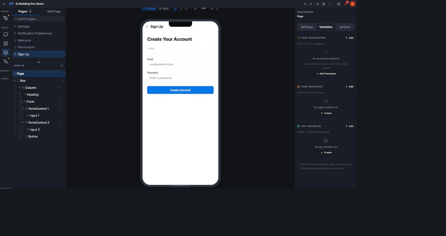
The Variables tab has three stacked sections:
* **PAGE PARAMETERS**: "Received from navigation." Empty state reads "No parameters declared / Add params to receive data from other screens", with **+ Add Parameter**.
* **PAGE VARIABLES**: "Local to this screen only." Empty state reads "No page variables yet", with **+ Create**.
* **APP VARIABLES**: "Global, available everywhere." Empty state reads "No app variables yet", with its own **+ Create**.
A footer tip ties them together: "Start with Page Variables. Only promote to App Variables when needed across screens."
"Actions" means two different things in this tab set. The **Settings** tab's ACTIONS section configures which icons appear in the header, with a simple built in behaviour. The separate **Actions** tab's **On Header Action** event is what runs when one of those icons is tapped, wired to the full action catalog. They are linked but they are not the same control.
## Variables tab
The Variables tab has three stacked sections:
* **PAGE PARAMETERS**: "Received from navigation." Empty state reads "No parameters declared / Add params to receive data from other screens", with **+ Add Parameter**.
* **PAGE VARIABLES**: "Local to this screen only." Empty state reads "No page variables yet", with **+ Create**.
* **APP VARIABLES**: "Global, available everywhere." Empty state reads "No app variables yet", with its own **+ Create**.
A footer tip ties them together: "Start with Page Variables. Only promote to App Variables when needed across screens."
 ### Create a page variable
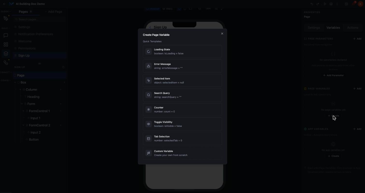
Click **+ Create** under **PAGE VARIABLES**. The **Create Page Variable** dialog offers eight quick templates, each a pre filled starting point:
| Template | Type and default |
| - | - |
| Loading State | `boolean: isLoading = false` |
| Error Message | `string: errorMessage = ""` |
| Selected Item | `object: selectedItem = null` |
| Search Query | `string: searchQuery = ""` |
| Counter | `number: count = 0` |
| Toggle Visibility | `boolean: isVisible = false` |
| Tab Selection | `number: selectedTab = 0` |
| Custom Variable | Create your own from scratch |
### Create a page variable
Click **+ Create** under **PAGE VARIABLES**. The **Create Page Variable** dialog offers eight quick templates, each a pre filled starting point:
| Template | Type and default |
| - | - |
| Loading State | `boolean: isLoading = false` |
| Error Message | `string: errorMessage = ""` |
| Selected Item | `object: selectedItem = null` |
| Search Query | `string: searchQuery = ""` |
| Counter | `number: count = 0` |
| Toggle Visibility | `boolean: isVisible = false` |
| Tab Selection | `number: selectedTab = 0` |
| Custom Variable | Create your own from scratch |
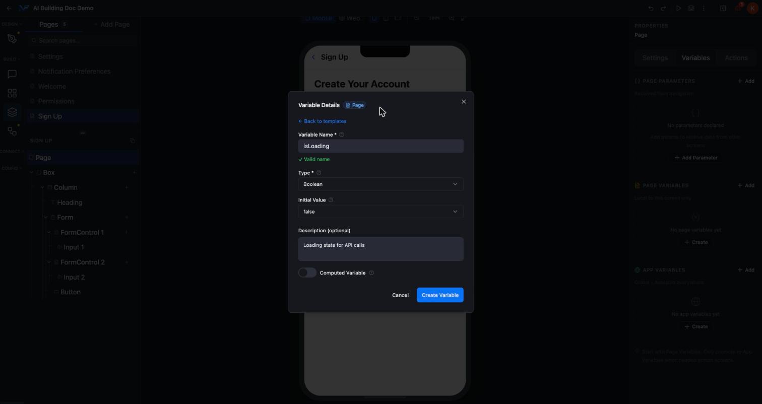
 Picking a template opens the **Variable Details** form, pre filled and fully editable: **Variable Name** with live "Valid name" validation, **Type**, **Initial Value**, an optional **Description**, and a **Computed Variable** toggle.
Choosing Loading State fills it in as name `isLoading`, type `Boolean`, initial value `false`, description "Loading state for API calls".
Picking a template opens the **Variable Details** form, pre filled and fully editable: **Variable Name** with live "Valid name" validation, **Type**, **Initial Value**, an optional **Description**, and a **Computed Variable** toggle.
Choosing Loading State fills it in as name `isLoading`, type `Boolean`, initial value `false`, description "Loading state for API calls".
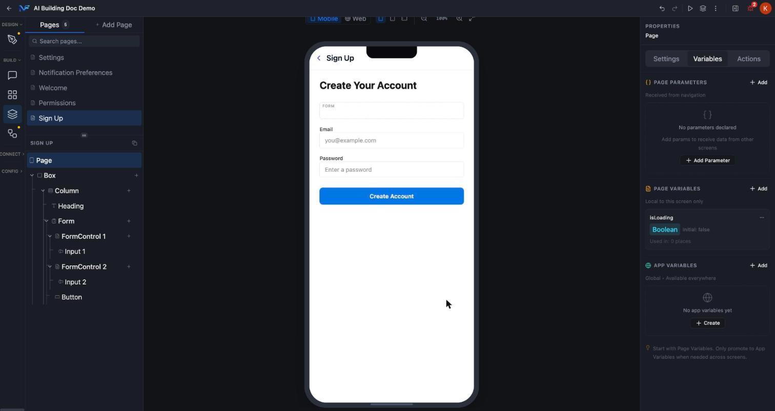
 Click **Create Variable**. The variable appears in the Page Variables list straight away, tagged with its type, its initial value, and a live reference count reading "Used in: 0 places" until something binds to it.
 ## Actions tab
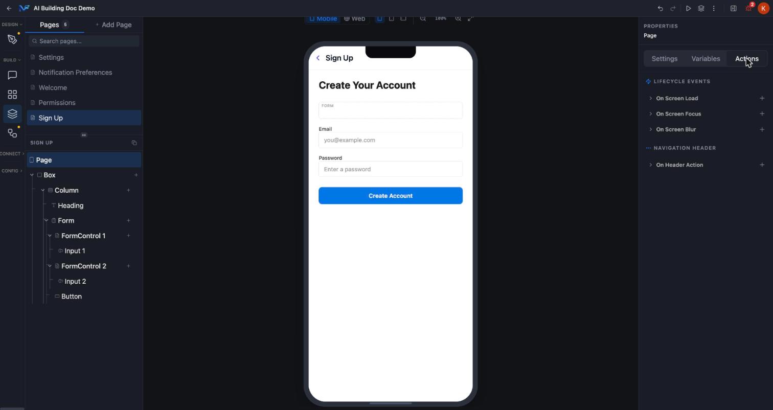
The Actions tab has two groups:
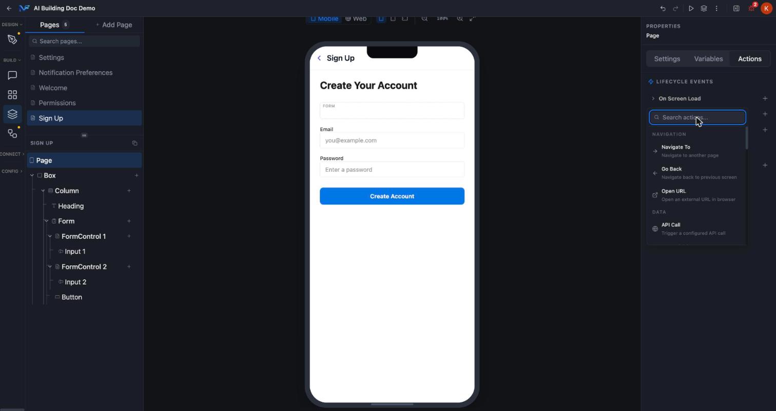
* **LIFECYCLE EVENTS**: **On Screen Load**, **On Screen Focus** and **On Screen Blur**, each with a **+** to attach an action.
* **NAVIGATION HEADER**: just **On Header Action**, which fires when someone taps a header icon you configured in the Settings tab.
## Actions tab
The Actions tab has two groups:
* **LIFECYCLE EVENTS**: **On Screen Load**, **On Screen Focus** and **On Screen Blur**, each with a **+** to attach an action.
* **NAVIGATION HEADER**: just **On Header Action**, which fires when someone taps a header icon you configured in the Settings tab.
 ### Attach an action
Click **+** next to a lifecycle event to open a searchable action picker. Search for the action you want and select it.
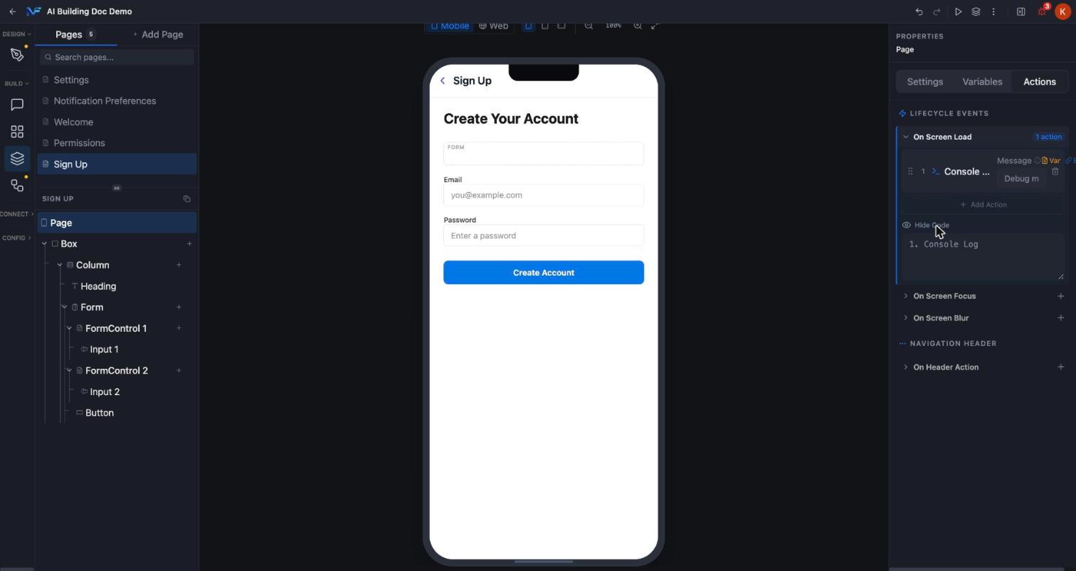
Selecting **Console Log** on **On Screen Load** attached it immediately. The row then showed a **1 action** badge and a numbered step with a **Message** field, plus an **Add Action** control for chaining more. A **View as Code** toggle reveals a plain language step list reading `1. Console Log`.
### Attach an action
Click **+** next to a lifecycle event to open a searchable action picker. Search for the action you want and select it.
Selecting **Console Log** on **On Screen Load** attached it immediately. The row then showed a **1 action** badge and a numbered step with a **Message** field, plus an **Add Action** control for chaining more. A **View as Code** toggle reveals a plain language step list reading `1. Console Log`.
 A Console Log attached to a page event will not show up in your browser's console while you use Preview. The Preview panel runs on a different origin from the Studio editor, so its output is not readable from the editor tab. The action did attach and run. The **1 action** badge and the **View as Code** panel are the signals to trust.
## The action catalog
Every lifecycle event, and **On Header Action**, opens the same picker: one shared searchable catalog, grouped by category, identical for every event. There is no per event list.
The catalog holds 22 actions across six categories:
* **Navigation**: move between pages or open an external URL.
* **Data**: trigger a configured API call or set a page or app variable.
* **Interaction**: alerts, toasts, haptics, clipboard and overlays.
* **Communication**: the native share sheet and composing an email.
* **Flow**: run TypeScript, delay, or log to the console.
* **Authentication**: sign in, sign up, sign out, OTP, magic link and password reset.
A Console Log attached to a page event will not show up in your browser's console while you use Preview. The Preview panel runs on a different origin from the Studio editor, so its output is not readable from the editor tab. The action did attach and run. The **1 action** badge and the **View as Code** panel are the signals to trust.
## The action catalog
Every lifecycle event, and **On Header Action**, opens the same picker: one shared searchable catalog, grouped by category, identical for every event. There is no per event list.
The catalog holds 22 actions across six categories:
* **Navigation**: move between pages or open an external URL.
* **Data**: trigger a configured API call or set a page or app variable.
* **Interaction**: alerts, toasts, haptics, clipboard and overlays.
* **Communication**: the native share sheet and composing an email.
* **Flow**: run TypeScript, delay, or log to the console.
* **Authentication**: sign in, sign up, sign out, OTP, magic link and password reset.
 Every action in the catalog, with its parameters and its description.
## Next steps
Reparent nodes, add conditional styling and control visibility per platform and breakpoint.
Place components on the page and set their own properties.
Every action in the catalog, with its parameters and its description.
## Next steps
Reparent nodes, add conditional styling and control visibility per platform and breakpoint.
Place components on the page and set their own properties.