

Overview
Most of a component’s look is chosen, not hand built. A Button is not red because someone typed#DC2626 into it. It is red because its Action is set to Negative.
Studio puts those choices in two blocks at the top of a selected component’s Style tab:
- APPEARANCE:
Variant,ActionandSize, the built in looks a component ships with. - STATE: on/off flags such as Disabled and Loading, which pin the component into that state so you can see and build against it.
Cycling Variant, Action and Size, toggling Loading and Disabled, and applying then clearing a themed preset.
Appearance: Variant, Action and Size
Select a Button and you get all three.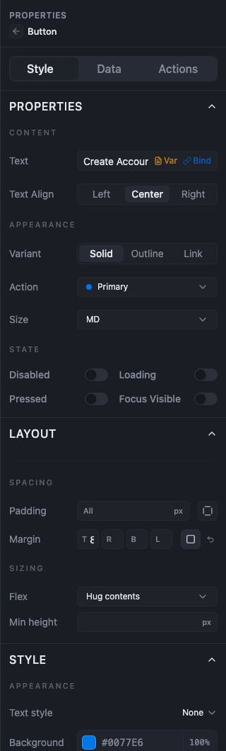
A Button's PROPERTIES block: Variant as segmented Solid/Outline/Link, Action set to Primary, Size set to MD, and the STATE toggles below
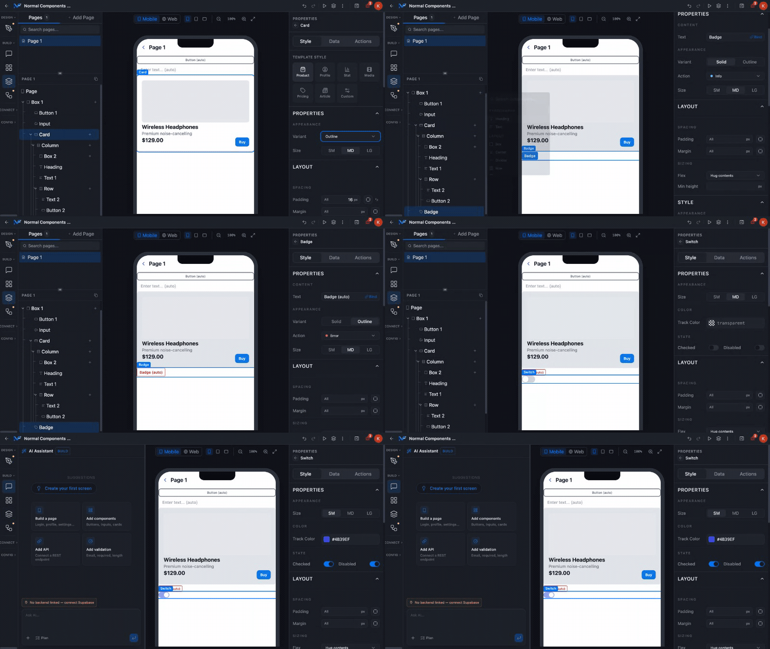
opening the Action dropdown and picking Negative, showing the five options with their colour dots
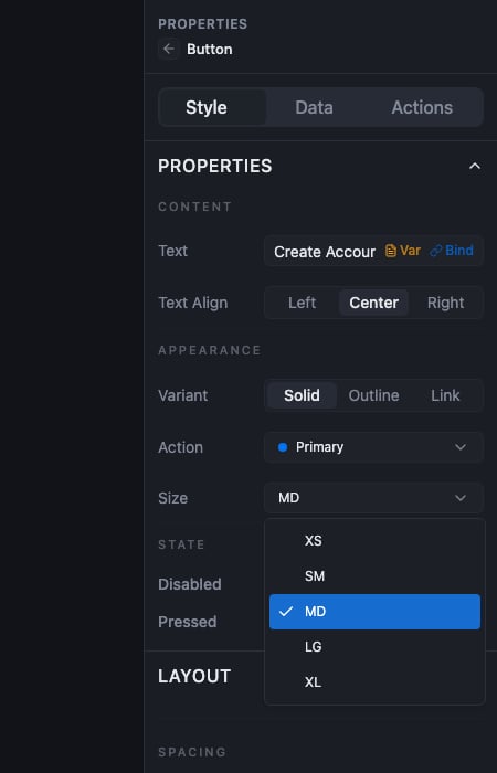
The Size dropdown open, showing XS, SM, MD, LG and XL with MD ticked
SM / MD / LG / XL rather than a dropdown, and adds a Type property a Button does not have. A layout component such as Box has no PROPERTIES section at all. Its panel starts at LAYOUT.The STATE section
STATE toggles do not describe a styling rule. They pin the component into that state on the canvas so you can design against it. A Button has four: Disabled, Loading, Pressed, Focus Visible. Two of them change what you see, and two do not.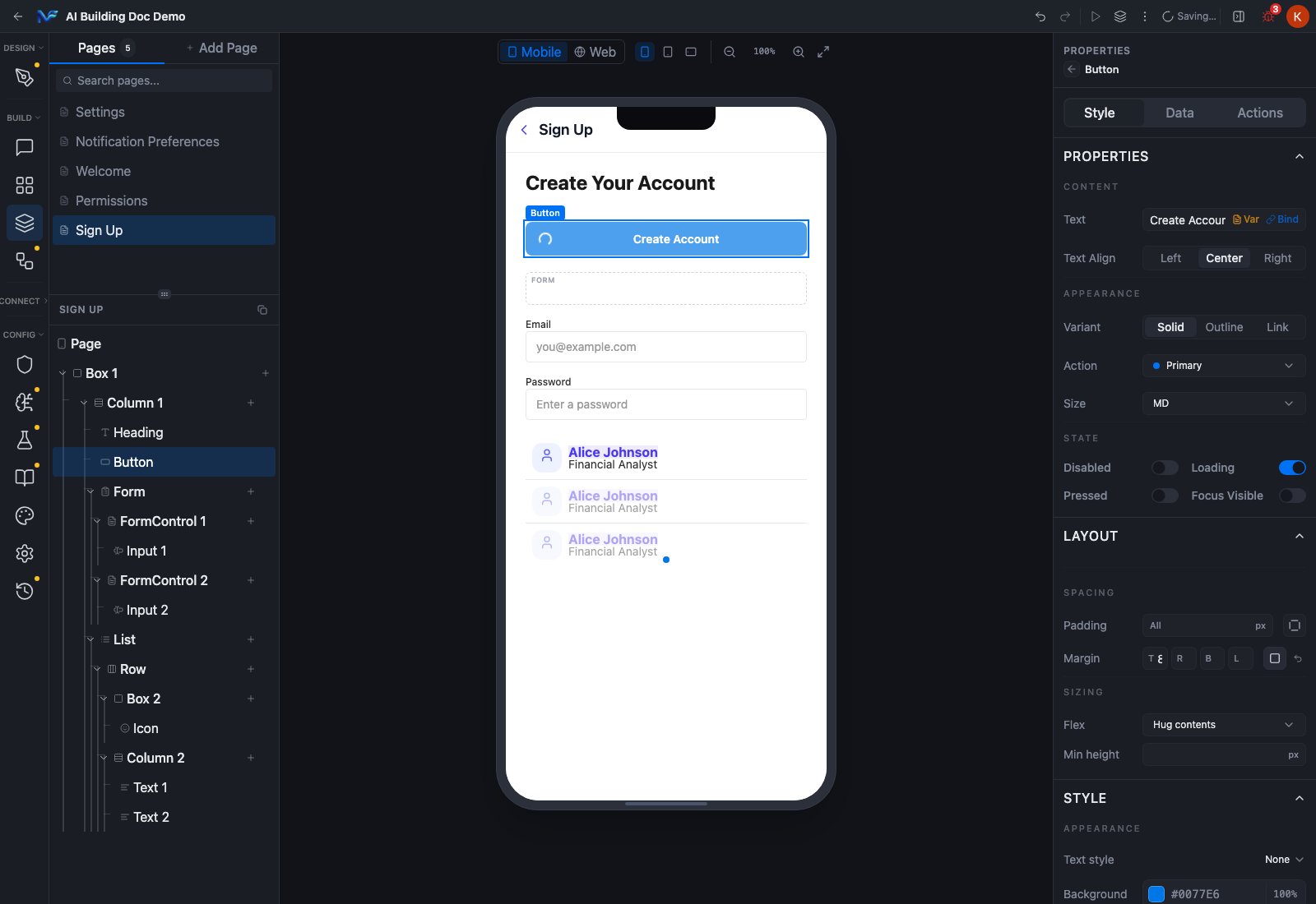
toggling Loading on, the canvas button swapping its label for a spinner, then toggling Disabled on and the same button dimming
STATE means boolean flags, not only interaction states
Different component types put quite different things in this section.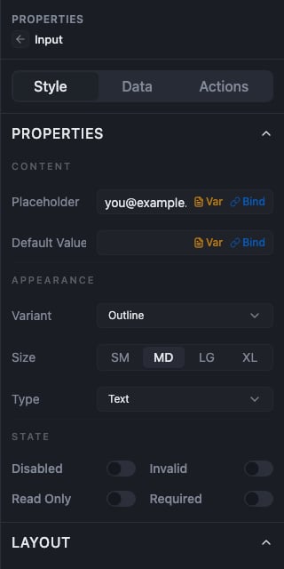
Input properties: Variant as a dropdown, Size as segmented SM/MD/LG/XL, a Type property, and a STATE section with Disabled, Invalid, Read Only and Required
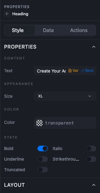
Heading properties: Size, Color, and a STATE section holding Bold, Italic, Underline, Strikethrough and Truncated
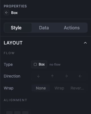
Box properties: the panel goes straight from the Style/Data/Actions tabs to LAYOUT, with no PROPERTIES section
Where per state styling lives
A selected component’s Style tab has, in order: PROPERTIES, LAYOUT, STYLE, CONDITIONAL, PLATFORM VISIBILITY, CONDITIONAL VISIBILITY, RESPONSIVE VISIBILITY, THEMED COMPONENT. Two of those carry a second look for a component:- Conditional styling, the
CONDITIONALtoggle, which gives you a second look for when a condition holds, such as a selected list row. - A themed preset, which is where hover overrides are defined. They live in the themed component editor and apply on the Web target.
Themed Components
Reusing a look across a project
If you want one component you configure once and reuse everywhere, that is a themed preset. If you want a group of components you can drop in as a unit, some types such as Card, List, CardList and Table expose a Template Style property that builds out a whole nested structure for you.Summary
APPEARANCE picks a component’s built in look, andAction is the property that carries meaning and drives colour. STATE pins a component into a flag state while you design, with Disabled and Loading being the two that visibly change the canvas on a Button. Reach for a themed preset when you need one look reused across a project.